On 5/26/2011 7:17 AM, Dawid Loubser wrote:
> . . .
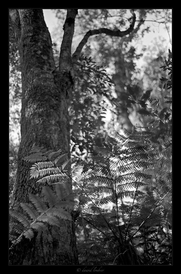
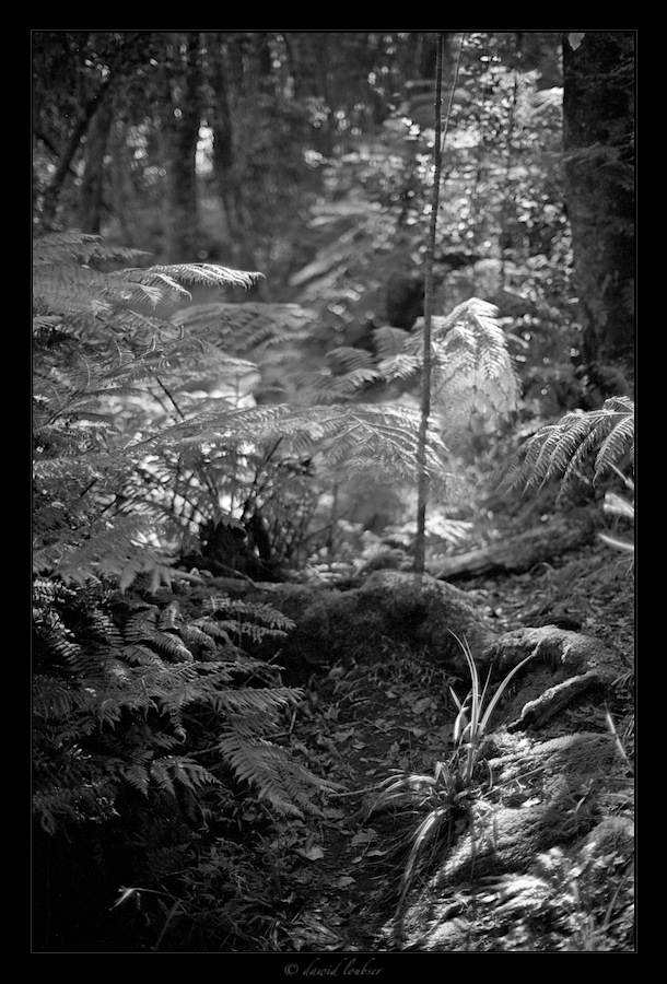
> The 21/2 has quite frightful coma towards the corners at f/2.0 (it's
> optically excellent by f/4.0 for 12x16in prints, BTW) so I am shooting
> it more and more wide open, trying to create layered, dreamy
> compositions. Here are two recently processed ones, from a (very
> muddy!) walk in the Knysna Forest.
>
> http://fc09.deviantart.net/fs70/f/2011/146/2/2/fern_valley_detail_01_by_philosomatographer-d3h8zge.jpg
> http://fc08.deviantart.net/fs70/f/2011/146/e/4/fern_valley_detail_02_by_philosomatographer-d3h8zhf.jpg
> (Both with OM-3Ti, Kodak TMY2-400, developed in D76 diluted 1+1)
>
> Does it work for you as a kind of "soft focus, but still quite sharp"
> aesthetic?
> (well, I know Moose hates shallow DOF...)
Little time, as we are getting ready for a three day weekend retreat. There is
Wi-Fi of a sort, but I'll probably be
largely too involved/busy to bother to do more than check for emergencies.
Still, how can I ignore the challenge? :-)
You've oversimplified my aesthetic feelings about shallow DOF. I don't hate it
as a matter of principle, and have even
been known to quite like a few examples. My problem with it is that it is very
difficult to get right and way too many
examples that are 'off' a little or a lot are put out into the world.
As I said before, your dreamy image of the little flower girl is quite
wonderful in all respects - except that the plane
of focus is in the wrong place. I posted an alternate version with the plane
relocated to show what I was talking about.
Good, worth seeing, yes. First rate? To my perhaps overly exacting standards,
not as shot and presented.
As to these images, I agree with a couple of others, the first doesn't much
appeal to me and the second comes very close.
Before going into other specifics, I have to say that the deep background bokeh
is just awful in both to my eye. To me,
getting that soft, dreamy look requires the image so get softer and smoother as
it goes OOF. Here, instead, it gets
hard, edgy and busy, destroying what I imagine the intent to be. OOF
highlights, instead of being relatively bright in
the middle, tapering off smoothly toward the edges, are dark in the centers,
brightening towards a sharp, bright edge.
Contrasty edges get doubled, rather than mooshing softly off.
The Pictorialists got the soft, dreamy look, sometimes too much for me, but
they had very different lenses than so many
modern designs. Clearly at these relative subject and background distances, the
21/2 wide open is not the tool "to
create layered, dreamy compositions", at least to my taste.
One may digitally blur the background, and make things much better, but I have
yet to find a really satisfactory way to
correct, rather than somewhat masking, an inherent lens flaw. This is one
reason I was trying to adapt an old Tessar
50/2.8 to one of my Canon digitals. I was hoping that an older asymmetric
design with very round aperture might have
better bokeh for dreamy images. Hmmmm, maybe it'll work on the 60D - 80 mm eq.
portrait lens?
As to the rest of these two images, I find it hard to tell whether the way the
tree fades into OOF just doesn't work for
me or whether it is, at least in part, the way the bokeh makes the bark look
wrong as it goes OOF. The composition is
OK, but doesn't excite me.
The second is, to my taste, a lovely composition, and well chosen for the
intended purpose, but for the bokeh. 'Twere
mine, I'd also be asking myself if another with the plane of focus back a bit
might be as good or better. As it is, I'd
crop off the top and blur and darken the bright shiny disks.
Shallow Moose
--
_________________________________________________________________
Options: http://lists.thomasclausen.net/mailman/listinfo/olympus
Archives: http://lists.thomasclausen.net/mailman/private/olympus/
Themed Olympus Photo Exhibition: http://www.tope.nl/
|