I agree with Moose about the color. I don't much care if it's really accurate,
just if it looks good to me. I ain't shooting for catalogs or nature field
guides, et al. There's barely nary a photo I process that I don't diddle with
the colors a dab or two just to make 'em look good to me. I recently posted a
couple of bluebird shots taken with the E-1 and 500/8 Zuiko. One was "souped
up" and the other was quite close to accurate. As I recall, those who
commented seemed to prefer the inaccurate one.
Righteous bluebird:
http://home.att.net/~hiwayman/wsb/media/192375/site1080.jpg
Gussied up bluebird:
http://home.att.net/~hiwayman/wsb/media/192375/site1079.jpg
As for C.H.'s examples, about the only real difference I can tell, other than
the slight difference in the color of the flowers, is that the Bibble shot
looks like it may have had the "fill light" thing used, a feature I find
fascinating and quite useful. But, hey, I'm easily amused. And I don't find
the interface to be all that bothersome. Maybe I just catch on quick.
I have today installed Picture Window Pro 4.0, and, yes, it's RAW conversion
results in a dreadfully flat image. I am seriously disappointed, as PWP has
long been one of my favorites. Extending the dynamic range sliders 25% in
either direction seem to pretty much correct the problem, but that shouldn't be
necessary. Still, I like a lot of the other things PWP does, so I'll keep
using it.
As far as the accurate color stuff goes and my opinion regarding it, you have
to remember that I was educated and trained as a journalist, and accuracy is
not something that journalists ever got their shorts in too much of a wad over,
and sure as hell not these days. :-)
--
"Anything more than 500 yards from
the car just isn't photogenic." --
Edward Weston
-------------- Original message ----------------------
From: Moose <olymoose@xxxxxxxxx>
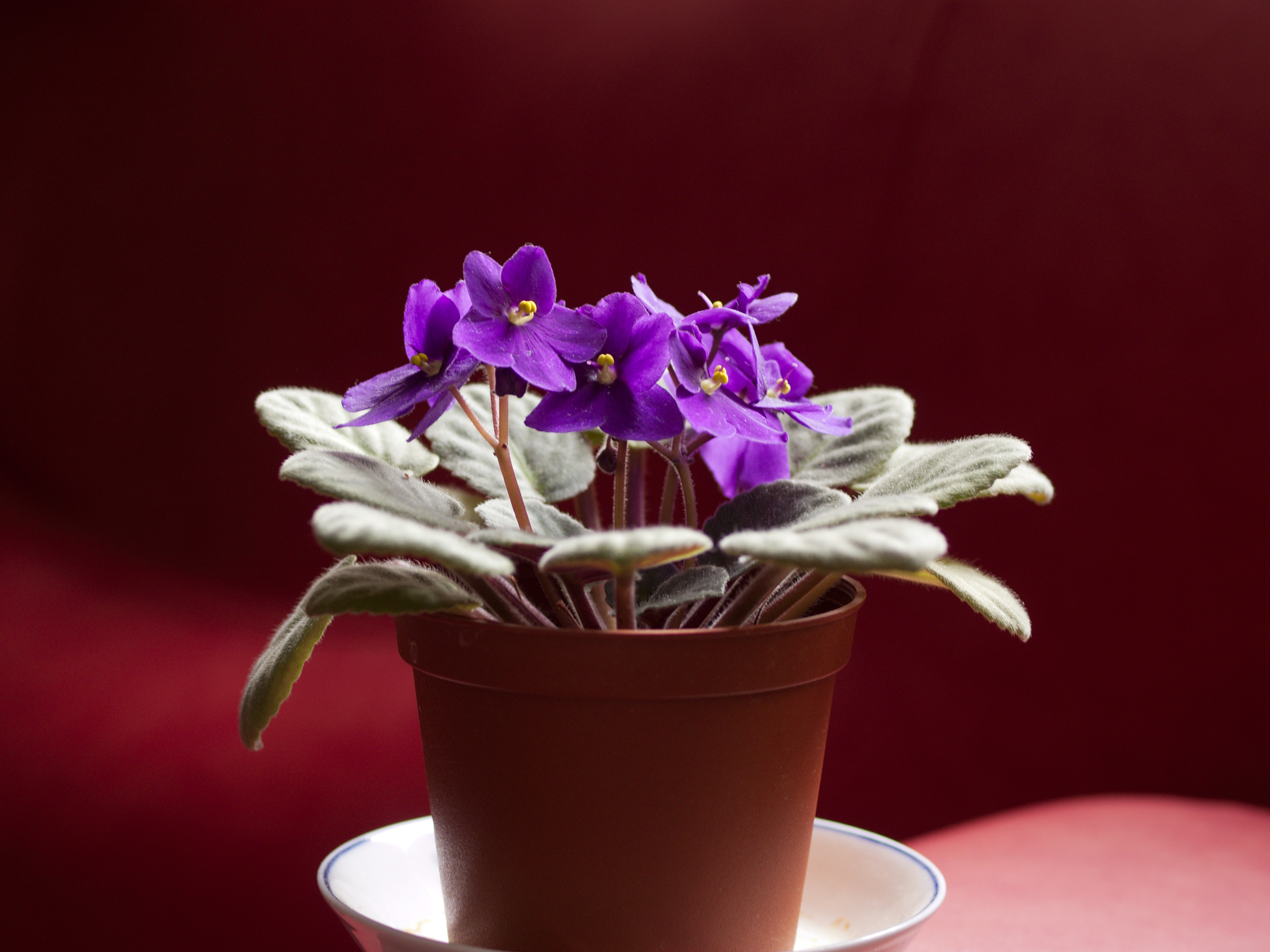
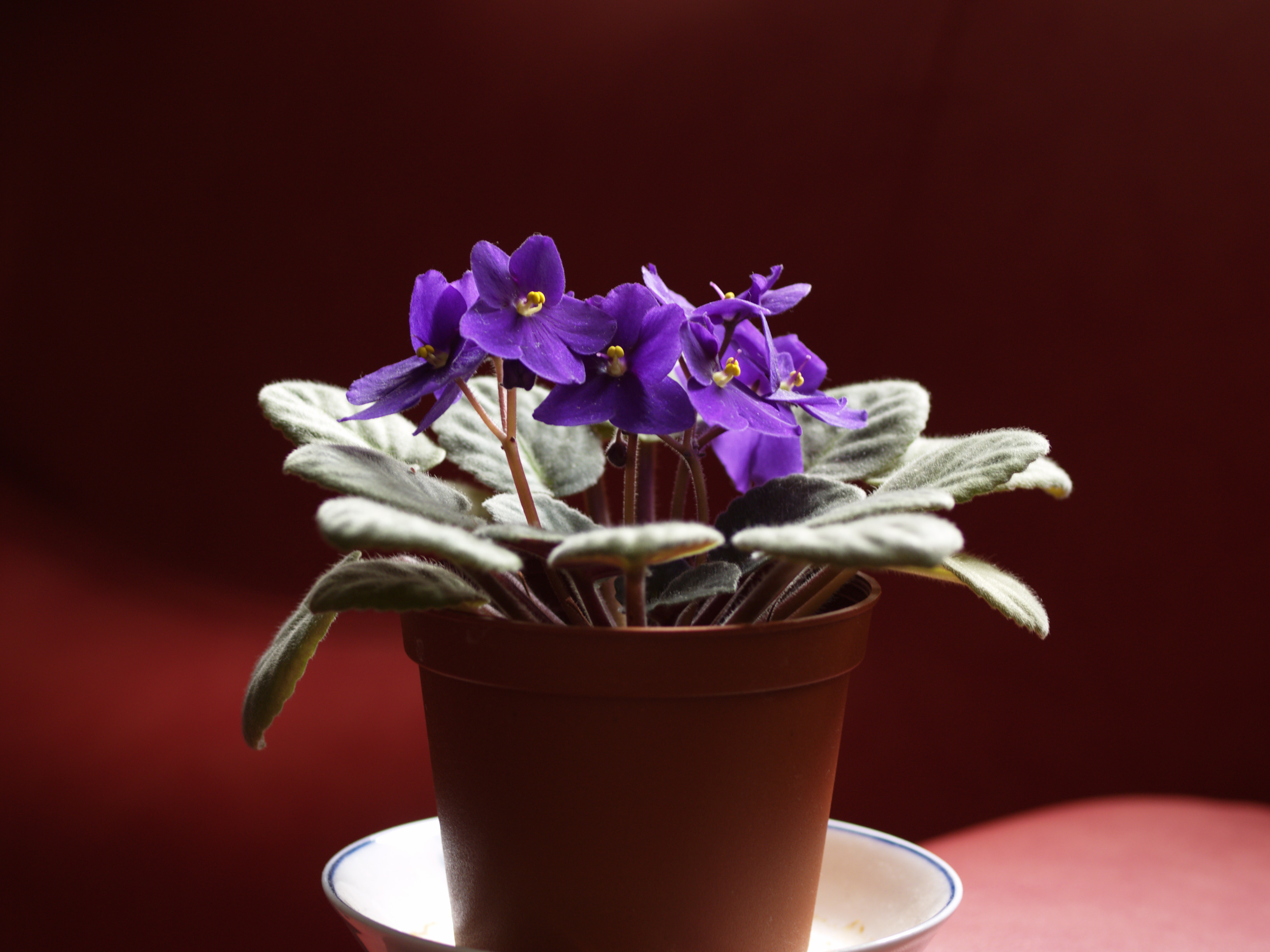
> C.H.Ling wrote:
> > As always, I like to proof with samples, just download the Bibble 4.7,
> > shot with E-300 and DZ50/2, camera default, no sharpening:
> >
> > http://www.accura.com.hk/OM/Bibble.jpg
> >
> > http://www.accura.com.hk/OM/olympus.jpg
> >
> > I don't think they are the same,
> Certainly not the same.
> > it is even not easy to PS the Bibble one to get the same like Olympus RAW.
> Not hard to get the flowers to match, but then small differences in
> other elements remain. Just a quick application of Color Match to a
> selection of the same part of one of the flowers in each example. Of
> course, I know your eyes are more color sensitive than mine, so what
> seems an infinitesimal difference to me may be too much for you
> <http://www.moosemystic.net/Gallery/Others/Violets.htm>.
> > My wife and young son both immediately identified the Olympus one has more
> accurate color (compared with the actual subject).
> >
> A larger question for me is how important perfectly accurate color is to
> me. I only ask the question because the vast majority of things I
> photograph are not later available at all, let alone in the identical
> light is which they were shot, for comparison with the screen or printed
> image.
>
> I've been playing around with the WhiBal. It certainly provides a way to
> assure very accurate color, certainly much closer than the difference in
> your examples, with any RAW process. Using it or something similar,
> accurate color should be easy whenever it's important.
>
> On the other hand, when I went out Thursday and shot over 140 RAW
> images, I left the WhiBal home. I knew that my camera and ACR would do
> quite a creditable job on the kind of things I would be shooting and
> that any subtle differences would never be noticed because subject and
> image would never meet.
>
> Moose
>
==============================================
List usage info: http://www.zuikoholic.com
List nannies: olympusadmin@xxxxxxxxxx
==============================================
|