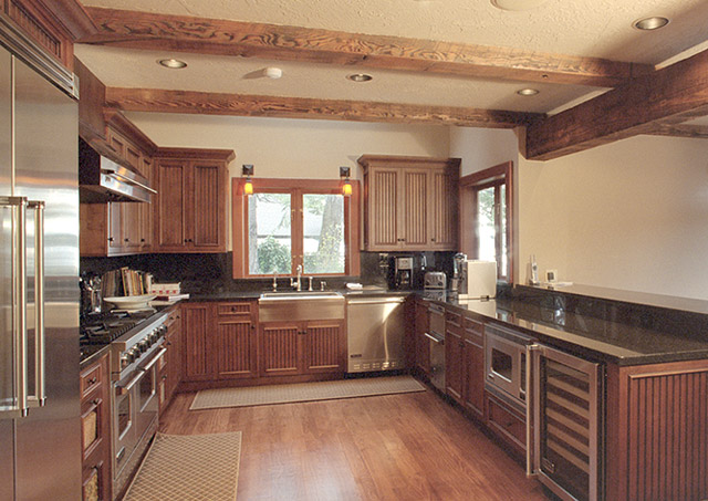
Mike wrote:
> Just finished taking some photos of the interior of a house I worked on
> last winter. (kitchen design and cabinetry) I still have a lot to learn
> about lighting. I used a 24 shift on my OM4, porta 160vc. Various
> combinations of photo flood and/or a remote T32 into an umbrella used as
> a diffuser. The portra was probably a mistake as the colors were way too
> saturated but I just wanted to finish off the roll. I ended up doing
> lots of tweaking to get the color somewhat uniform shot to shot and
> reasonably accurate. I'm open to suggestions for a better film to use
> and better ways to use the lighting.
>
> This is the entryway.
> http://www.interisland.net/watershed/mike/Cabinets/Miles-Clark/M-Chouse22a.jpg
>
> Here are some of the better interior shots:
> http://www.interisland.net/watershed/mike/Cabinets/Miles-Clark/M-Chouse02a.jpg
>
Well, I've got no idea what the original looks like, but I find the
pictures quite uninviting. Nobody's going to sell me a house or cabinet
work with such washed out looking images. It looks sort of like images
scanned in VuesScan with no film profile, no curve and white point set
very close to 0.

In the kitchen, there is no warmth to the wood and there is a veiled
quality to the whole image, maybe from the outside light all over the
place. Here's my take on it <cid:part1.09090406.05030403@gmail.com>.

The front of the house seems to suffer from blah, overcast day syndrome,
together with flat scanning  I know I may have gone a bit overboard, but
doesn't this look more inviting <cid:part2.00050007.05050000@gmail.com>?

I know next to nothing about lighting interiors for architectural shots.
There seems to be plenty of it in these shots, but it's awfully cold and
harsh feeling, more a color balance thing.

Moose

==============================================
List usage info:     http://www.zuikoholic.com
List nannies:        olympusadmin@xxxxxxxxxx
==============================================
|